 back |
 home |
 next |
Gray, and How Much?
Generally one should keep the number of variations of gray low, and use it as just an accent. I usually only use two for flat shading, with three only on rare occasions. The eye seeks contrast, so toning should be used to add contrast and visual interest to the piece. With too much gray the picture will become muddy and indistinct.
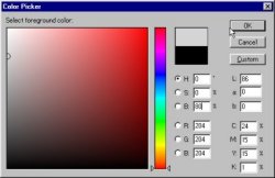
Use the color picker to make your tones, and remember the percentage gray you used with Zip sheets. My tendency was to use a 20% and a 60% gray. On your computer in Photoshop, on the third window from the top marked B, enter the negative value of your gray percentage plus 100. For example, for a 30% gray, you would enter 70.
Try just two gray values to start with. Also, don't use any values darker than 20 (80%) because in reproduction it will go black. Reproducing anything lighter than 85, or 15%, is also a bad idea, as it lightens and fades in some screen resolutions so much that it might as well be white. Also, the values listed as R, G, and B should be identical, not tinted.
Adding Tone
The file should now consist of two layers -- a background and a hidden inking layer. The background layer is the one you'll be working on.
Your first instinct might be to use the Bucket tool to fill what seem to be discreet areas of the artwork. Unfortunately, no one's inking is quite that perfect. Spot gaps in the lines and other mistakes, without having to use the Undo function, by using the Magic Wand tool. For example, look at the woman's ear -- the line was unfinished in the original. I wanted a light tone inside the ear, so to fix it in the image I used the Pencil tool, using the color the area would later be filled with. Zoom in tight if you have to, to spot unfinished lines which can allow area selections to grow out of bounds. Once the unfinished lines are closed, use the Magic Wand to select the area to be filled. If you need to, <control><d> de-selects without having to point and click again. If the Marquee is distracting or in the way, <control><h> hides it without de-selecting. Don't forget it's still there after you finish your task, though.
It is important to not use smoothed or anti-aliased lines, or the Paintbrush, because otherwise there will be white lines when you fill the areas afterwards. Also, the resolution of the file should be high enough that 'jaggies' are smaller than your printer's resolution. Remember, the objective is a crisp graphic presentation.
| this tutorial | ||||
 back |
 home |
 next |
||
| Tutorials | ||||
 back |
 Home Page |
 next |
||


